Color Text Questions
Review Questions 1-11
1. What factors influence the psychological impact color has on people?
A: Age, gender, culture, and life experiences.
2. Summarize the feeling each of the following colors evokes in people: red, green, and violet.
A: Red: power, danger, fire, strength, and passion
Green: refreshing, peaceful, cool, and friendly
Violet: royal and dramatic, compliments a variety of other colors
3. Name the secondary colors. What primary colors, in what proportions are used to make each?
A: Orange is an equal mixture of yellow and red.
Green is an equal mixture of blue and yellow.
Violet is an equal mixture of blue and red.
4. What color name is listed first in the name of a tertiary color?
A: The color that is primary is listed first.
5. Contrast value and intensity of color.
A: Value- the lightness or darkness of a hue
Intensity- the brightness or dullness of a hue
6. What are the differences between tint, shade, and tone?
A: Tint- add white to a hue
Shade- add black to a hue
Tone- add grey to a hue
7. Summarize how to neutralize a hue.
A: To neutralize a hue one must add a neutral color such as black, brown, or white to a hue.
8. Name 2 cool colors and 2 warm colors.
A: Warm- yellow, orange
Cool- blue, green
9. Identify an example of each of the 7 color harmonies.
A: Monochromatic
Complimentary

Split-complimentary
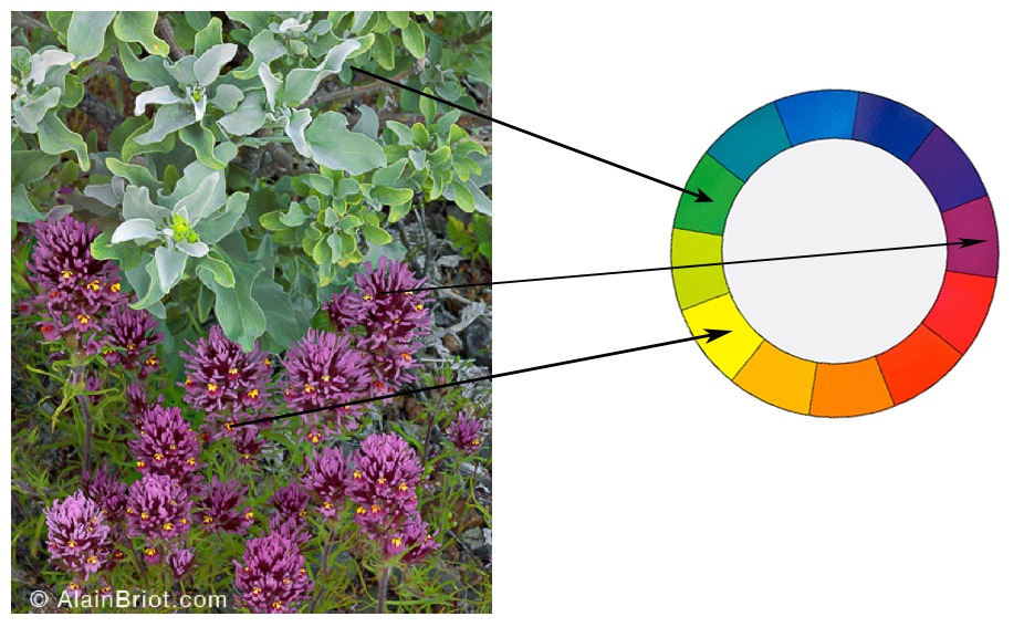
Double Complimentary

Analogous

Triadic

Neutral

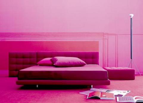
10. What factors influence the way color harmonies are used in planning an interior design?
A: Mood, lifestyle, function of room, items in room, location of room
11. Summarize the guidelines for using color correctly in a room design.
A: Use contrasting colors to draw attention
Dominant color should take up 2/3 of the room
Small rooms can appear bigger when cool colors are added
13. I would choose a dark orange with bright studio style lights so the room is cozy with warm colors but it still has a cool feeling.
Green: refreshing, peaceful, cool, and friendly
Violet: royal and dramatic, compliments a variety of other colors
3. Name the secondary colors. What primary colors, in what proportions are used to make each?
A: Orange is an equal mixture of yellow and red.
Green is an equal mixture of blue and yellow.
Violet is an equal mixture of blue and red.
4. What color name is listed first in the name of a tertiary color?
A: The color that is primary is listed first.
5. Contrast value and intensity of color.
A: Value- the lightness or darkness of a hue
Intensity- the brightness or dullness of a hue
6. What are the differences between tint, shade, and tone?
A: Tint- add white to a hue
Shade- add black to a hue
Tone- add grey to a hue
7. Summarize how to neutralize a hue.
A: To neutralize a hue one must add a neutral color such as black, brown, or white to a hue.
8. Name 2 cool colors and 2 warm colors.
A: Warm- yellow, orange
Cool- blue, green
9. Identify an example of each of the 7 color harmonies.
A: Monochromatic
Complimentary
Split-complimentary
Double Complimentary
Analogous
Triadic
Neutral
10. What factors influence the way color harmonies are used in planning an interior design?
A: Mood, lifestyle, function of room, items in room, location of room
11. Summarize the guidelines for using color correctly in a room design.
A: Use contrasting colors to draw attention
Dominant color should take up 2/3 of the room
Small rooms can appear bigger when cool colors are added
13. I would choose a dark orange with bright studio style lights so the room is cozy with warm colors but it still has a cool feeling.
 \
\


